

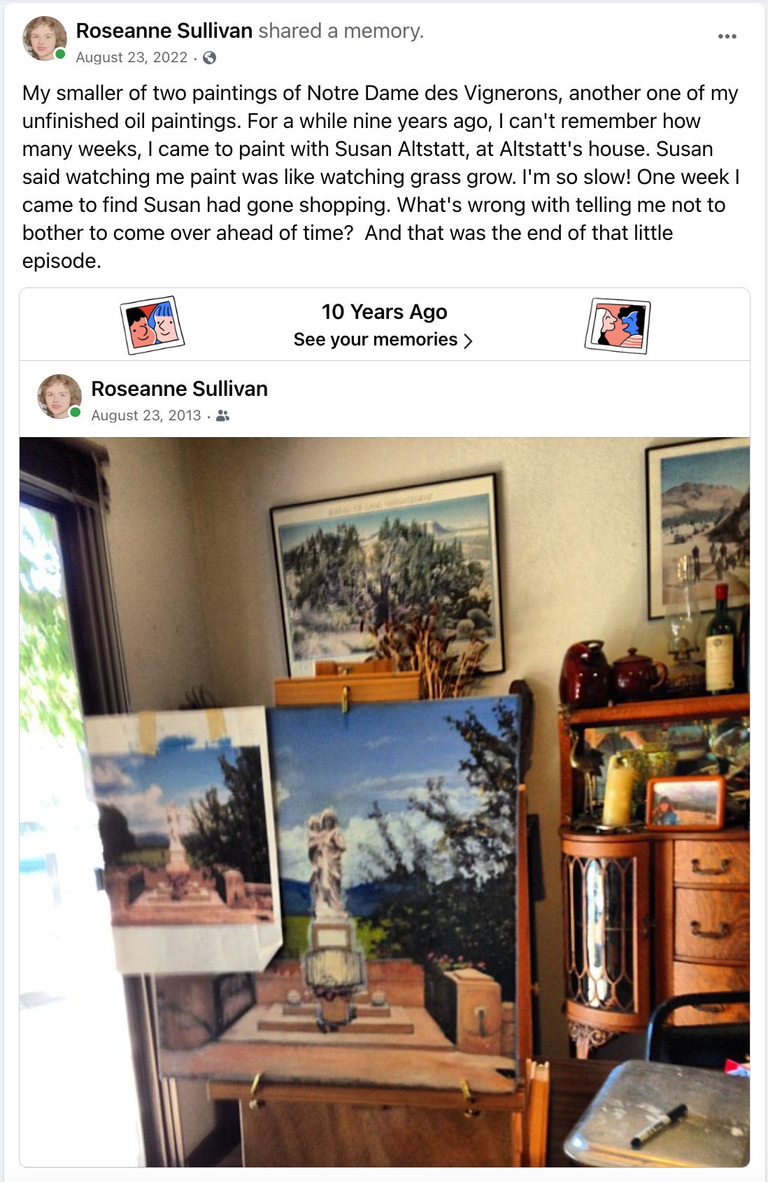
Notre Dame des Vignerons
Catholic Artists Connection featured my oil painting, Notre Dame des Vignerons, in their newsletter today. Here's the story behind the painting, with a digression on five-layer oil painting technique.


This statue captured my Catholic imagination in 1995, after I photographed it during my only visit to France. I glimpsed that beautiful Madonna and child statue as my son and I were driving out of the village of Vacquieres, in Languedoc Roussillon, where we were staying for a week. (Languedoc-Roussillon is a famous wine region in the south of France, which was administratively joined with the region of Midi-Pyrénées to become Occitania in 2016.) We were staying at Le Mas des Rives nearby, one of the great rustic vacation accomodations you can find all over rural France where Parisians and other big-city residents go for their mandatory five-week-long summer vacations. (Ce n'est pas juste! )
I signed us up after I had seen an ad for a yoga retreat at the California Yoga Center where I took weekly classes in Palo Alto. As it turned out, the ad was created by a Chicago-resident France-born yoga teacher, who rented Le Mas de Rives for us to stay and a small yoga studio for us to practice, in the middle of vineyards about 50 miles north of Montpelier. My son and I both practiced yoga for some time seeking relief from back pain from varying degrees of scoliosis, his spine’s slight curvature was painful, and mine was much more extreme, but more of a psychological affliction than a physical pain. This was before the potential spiritual dangers of yoga practice became apparent to me, and we stopped practicing. Besides it never helped his back pain, and the stretching of contracted tendons around a spinal fusion eventually made some things worse for me.
Back to Notre-Dame des Vignerons. The Madonna statue was charming in itself and its location was incomparable, against a background of vineyards with the mountain Pic San Loup behind it. Especially charming to me was that in 1954, the winegrowers (vignerons) had erected that statue with a wine cask as a votive offering at the Madonna’s feet.
Back at home, I first did a watercolor study from the photo.
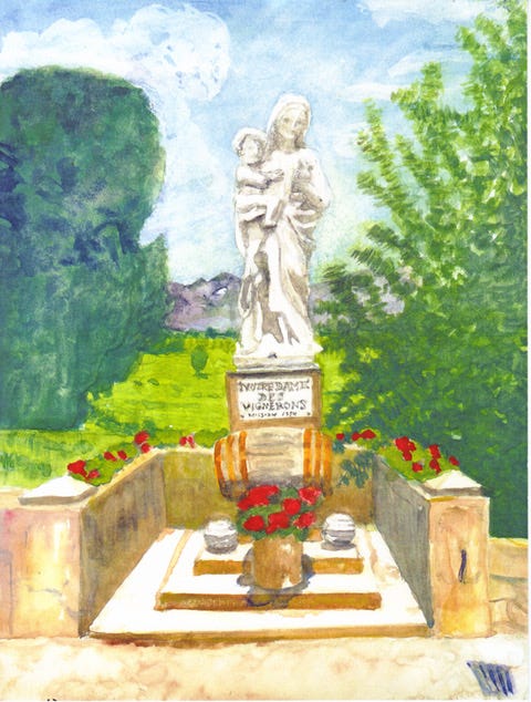
Later at different times I started two oil paintings of the scene, one in horizontal (landscape) orientation, and one vertical (portrait). In the portrait version shown under this post’s title, I experimented with using a five-layer glazing technique supposedly practiced by the old masters that I’d found described on the Internet.
You can see the landscape version in the following snapshots from Facebook posts of photos I took in 2012 and 2013.
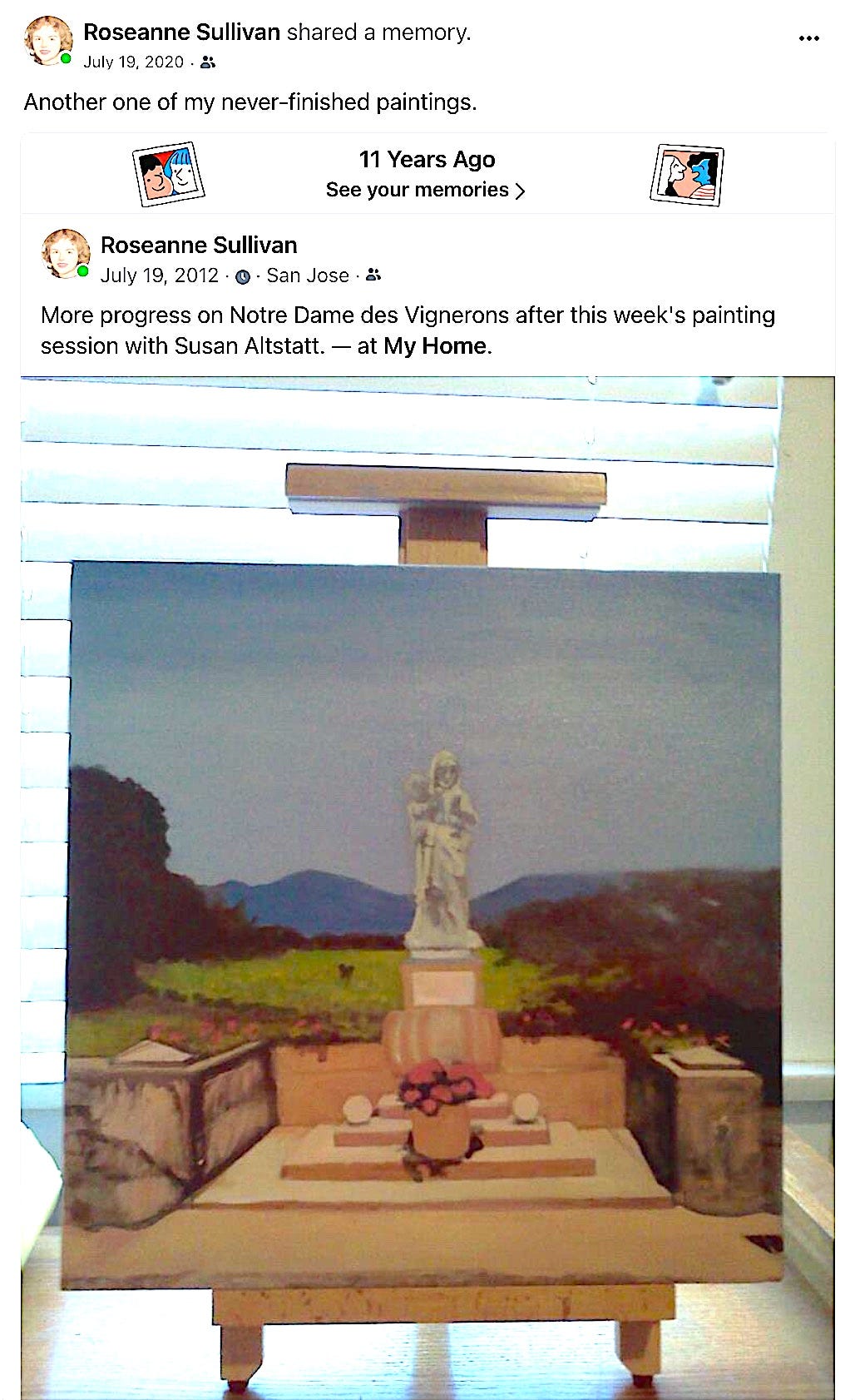
Incidentally, Susan Altstatt, who I mentioned as visiting for painting sessions for awhile in the following screenshot, is a recognized and often-collected painter of Western scenes done in acrylic and the creator of many lovely large sized illuminated chant pages used by the St. Ann Choir. Some example of her illuminated chant pages are here and here.
I’ve later come across other websites that describe oil paint layering techniques, which were supposedly practiced by the old masters and were the secret behind the depth of color that resulted, and those other sites describe simpler methods, in which only certain parts of the painting are painted in layers. But I literally followed the only instructions I had then, and in the portrait version of the Notre Dame des Vignerons and in another painting Justus et Palma Florebit, I doggedly painted each layer over again very exactly. It’s obviously taxing doing the same painting over and over again. So eventually I wearied, and I finally quit both paintings at the third, sepia, layer.
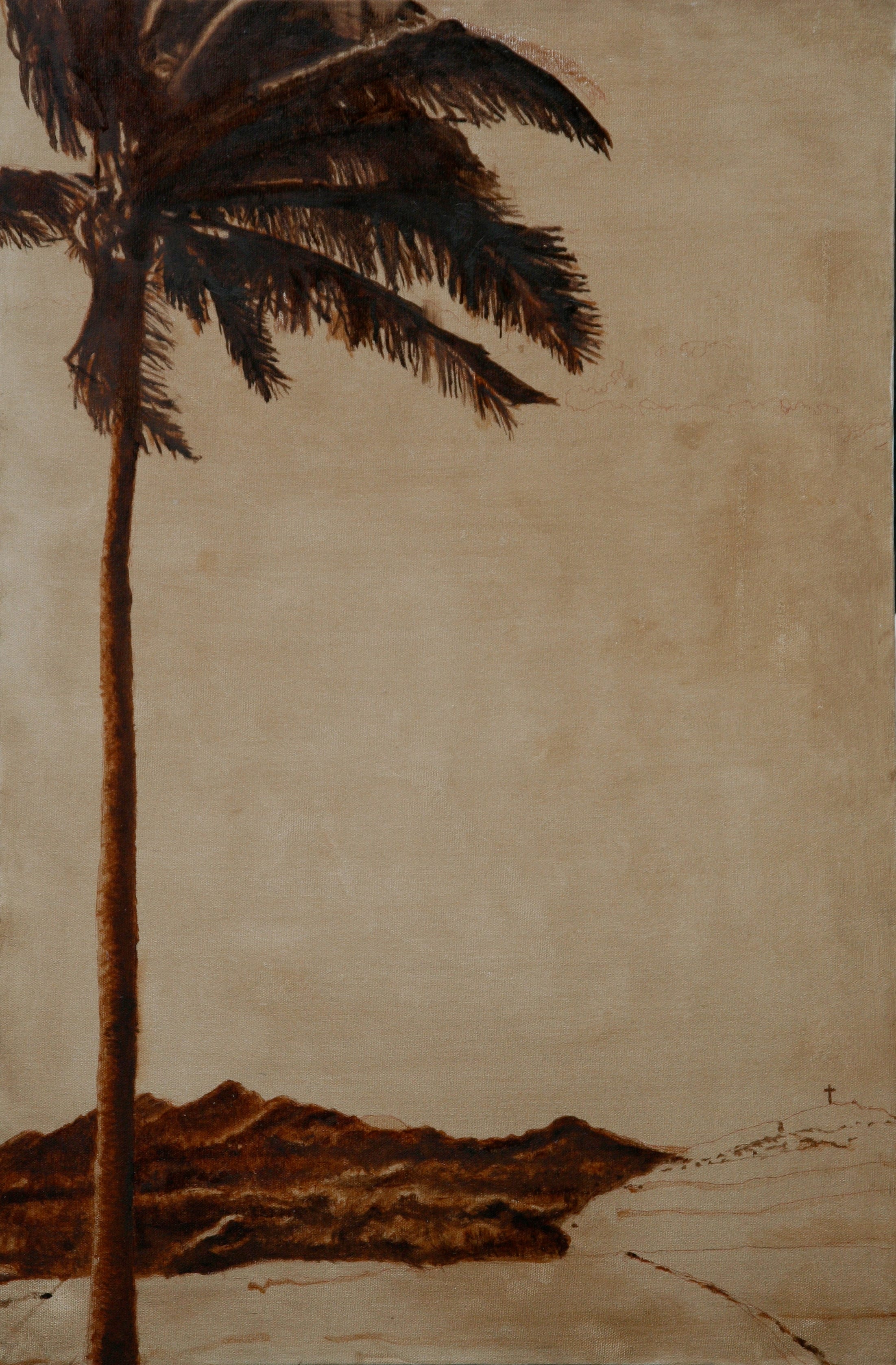
Speaking of Justus et Palma Florebit, here is the original photograph, which I took during one of three trips to Hana, Maui. I started going to Hotel Hana Maui Resort for yoga retreats (yes yoga again), once by myself with a group from the California Yoga studio in Palo Alto and once with my son and the same group. For my last time there, Lolly Font, the CA yoga founder, got me a much-reduced affordable room rate through her long-time association with the hotel owners, and I took my mother on a trip for just the two of us, on what turned out to be her first real vacation, and sad to say, her last. But that’s a whole other story, which happily brought about an unexpected reconciliation of years’ long strife between us, which I must recount some day.
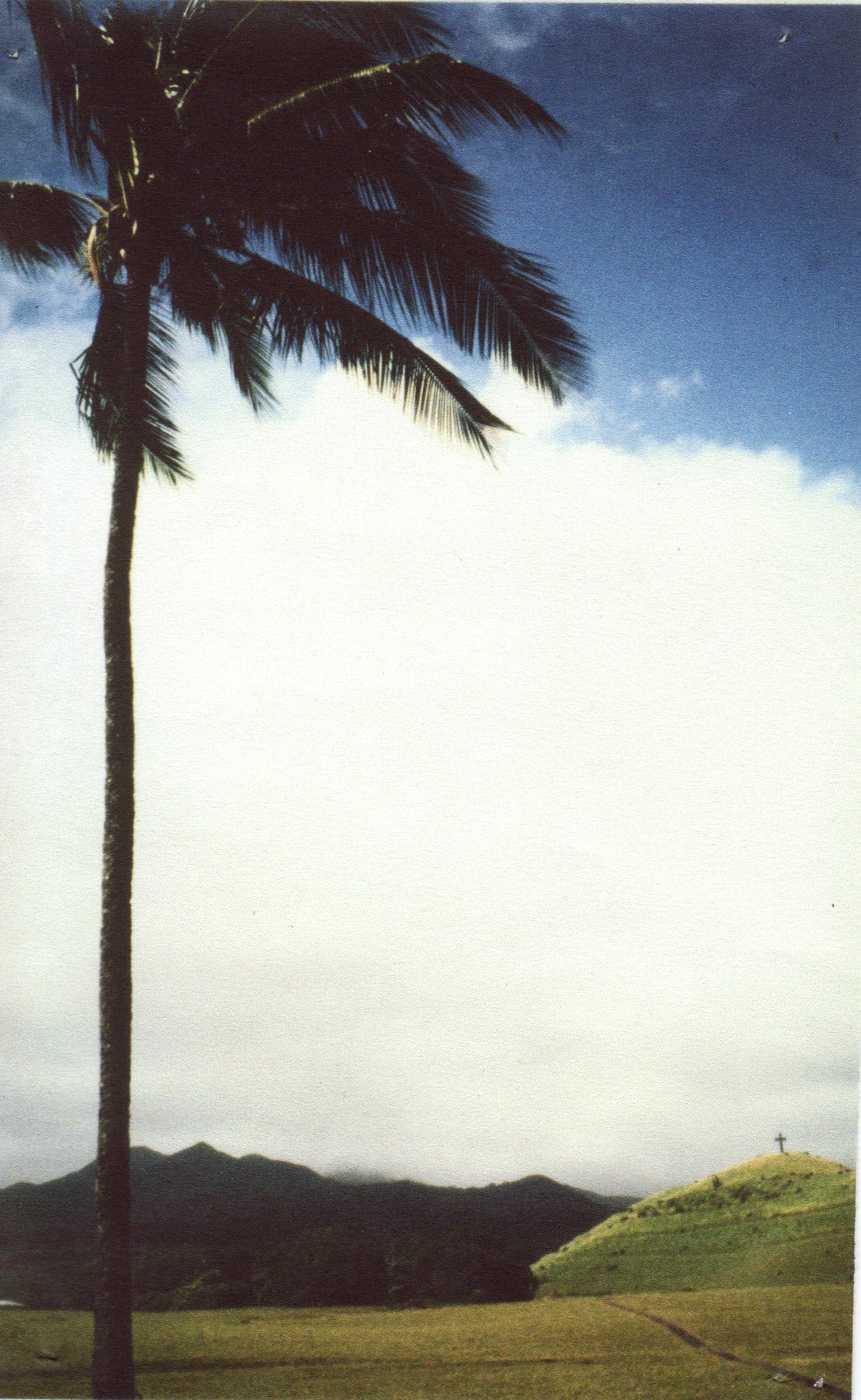
"Justus Ut Palma Florebit" is the phrase that begins a commonly occurring antiphon that is sung or recited as part of a prayer on various feasts at traditional Latin Masses, and it means “The Just Man Shall Flourish like the Palm Tree.” I chose that title to memorialize Paul Fagan, an extraordinarily “just man” I learned about in Hana. Fagan was the wealthy investor son of a millionaire. He was exemplary because his investments first in a cattle ranch and second in a luxury hotel, which eventually became the Hotel Hana Maui, the #1 luxury resort on Maui, helped keep the local economy alive in the 1940s and beyond. The friendly local residents who cleaned our suite of rooms told me and my mother about how Fagan’s investments had provided jobs for workers who were left without employment after Hana’s six sugarcane plantations had closed. Without Fagan, many more of the locally established Hawaiian workers would have otherwise been forced to move away with no source of income.
Fifteen years after Fagan died, in 1960, a 30 foot cross of black lava blocks was dedicated on a hill across from the hotel, which you can see as the diminutive cross on the hill on the lower right of my painting, while an extremely flourishing palm tree dominates the painting’s left side.
Here’s the cartoon I did with charcoal on the canvas before I started to paint the portrait version of Notre-Dame des Vignerons. Oftentimes, in my own and other’s works, I’ve liked the under drawing better than the final result. What do you think?
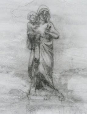
Several people have told me they prefer the sepia paintings to what they imagine would have been the final results if I'd gone on to do the grisaille layer and final tinting. Do you have a preference?
Delightful read, Roseanne! If the sepia rendition is the first one, I like that. The charcoal is nice too!